Making a Video: The Redemption Arc

Wait, isn’t an animation a video as well?

In this assignment, I had to make a minimum 3-minute video and publish to YouTube. Unlike the last project, however, this one is about making a commercial, instructional promotional video or a trailer, and while animation certainly is a video, this one does not have to be an animation (you can record in real life for the video, or even do a compilation of others’ videos). Thanks to how similar this is to the last one, I had a perfect chance to reflect on the issues I had with the last project to improve on in this video.

A good topic and a good tool

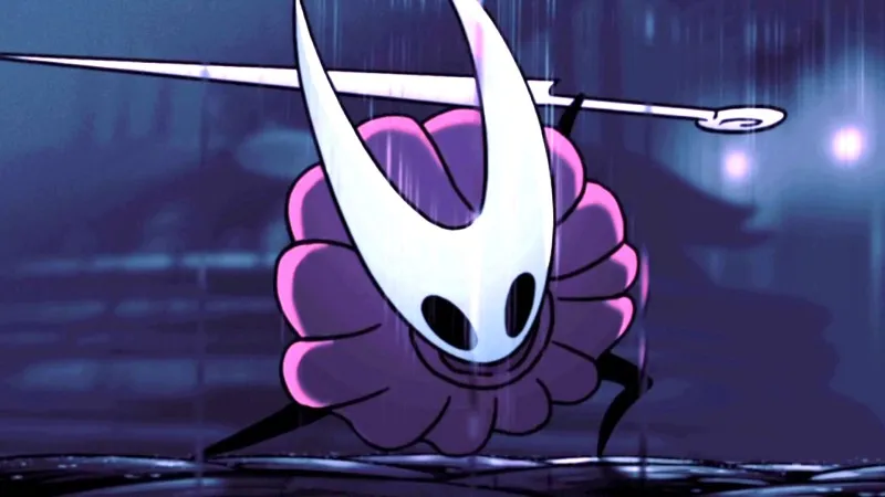
With the content of the video being restricted to commercial, instructional or promotional materials, there were not many options for topics to begin with. I could do a game trailer video by compiling the promotional materials for the game that I could find online, but that would be incredibly uninspiring and I would have little chance to actually learn or improve. I could also do a video essay again, either on another character design, animation breakdown or game design analysis, but the content and editing styles would be a bit too similar to the last video (albeit there would not be a talking human model on the screen all the time). In the end, I decided to do a boss fight guide, specifically a guide on Nightmare King Grimm in Hollow Knight, since the fight is fun to play and analyze, and technically this would fall under ‘instructional’ materials.

As for the tool to edit the video, the one that was given to everyone was WeVideo, another “free” tool that locked many of its features under the premium plan and basically tried its very best to annoy its users into buying premium. Luckily for me, I happened to have a Macbook, and in MacOS there is a great free application called iMovie. This app comes with great features that allows one to edit video quite professionally (at least as far as I can tell), and its intuitive interface had probably saved me hours from cutting video footage and editing audio for the project.

How to defeat the boss’ in 5 minutes

Even though there was technically no maximum length requirements, I was writing the script under the assumption that it should not be going over 5 minutes. This is partly because of the 4-5 minutes length requirement/limit from the last assignment, is also a decision I made so that I would have enough time to actually prepare and make the video in time of the deadline. If the script were too long, I would have to spend much more time recording game footage, recording audio and editing.

On the other hand, there are a vast number of different parts I could break down and discuss in the guide. I could talk about the anticipation animation of each attacks and how to recognize them, different strategies to dodge or counter an attack or different builds and play styles to go against the boss. For reference, this guide by Perpetual Noob for the same boss fight is 26 minutes long, and if you subtract the lore and story part of the video, it is still 20 minutes long. I need to figure out a way to reasonably remove contents and keep the script at about 5 minutes at most.

The script I wrote for the video

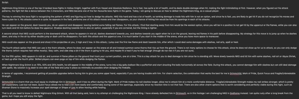
That was when I came up with the concept of ‘Casual Play’. The idea is that it is a series on how to defeat difficult bosses or challenges as a casual video game player, meaning instead of discussing all different approaches to a boss fight, I only need to keep it simple and discuss the easiest way (although this might also be subjective to an extent) to defeat that challenge. This allowed me to cut down the script to the most basic contents and keep the video from being to long and time-consuming to make.

A simple logo I designed for Casual Play, created in PowerPoint

Recording footage and audio

While I certainly could use online footage for the video, I wanted to record my own footage since it does seem a bit weird if a video about boss guide does not even show the attempts of the video creator, and I also have more control over the environment and variables (and I have an excuse to play more Hollow Knight as well). I ended up spending about 3 hours purely for recording gameplay footage with over 10 different clips and probably over 20 attempts with both failed and successful attempts. I also realized that recording footages myself also has some disadvantages, most notably the occasional frame drops because of the recording software (I used OBS for video recording) opening at the same time as the game. In the end, I also had to used 2 outside videos, as there are some skills and interactions that were basically too difficult and time-consuming for me to try and pull off myself.

The user interface of OBS

Learning from my past mistake, I decided to not use text-to-speech at all and record audio myself instead. It was certainly a hugh pain to find a good time and place to record the audio without getting disrupted, and it also did not help that I got quite anxious every time I have to record myself (or, to an extent, hear my voice recording). In the end, the result was far from perfect, but it is still much better than hearing a robotic voice.

Editing video? Easy

With all preparations finished, all I had left was editing the video in iMovie. The process was pretty easy and straightforward with the good UI of the application. For example, I did not even need to cut the footages beforehand since I could just add them into iMovie and use drag and drop to crop the way I wanted (I could also preview them so that I know where to start and stop).

Compare to the last project, I also made a few different decisions that I feel did improve the result in the end, one of which includes not meeting some requirements of the video. One particular example is the requirement that I must have 3 layers of videos at some point in the video, which I could not find a suitable place to utilize without disrupting the overall flow and feel of the video, so I did not use it at all.

I also decided to add a 3-minute unedited footage at the end of the video, which is a successful attempt of me defeating Nightmare King Grimm, as I found it a bit unsatisfying to watch a guide video without the actual attempt of the video creator defeating the boss using the guides, strategies or tips they provided in the video for the watchers. It did increase the total length of my video to over 8 minutes, but since it is an unedited footage, I did not have to spend much time adding that to the video or recording commentary audio there.

The end result

In the end, even if I was not able to meet all the requirements, I am much more satisfied with my end result. There are still issues here and there, such as the audio being a bit unnatural (which is partly because I was reading the script word by word and was pretty anxious at the time of recording), but the video does have a much more professional feel to it and is a definite improvement over my animation project.

Making an Animation, But Not Really

I did not know what to expect when the assignment required me to make an animation. I certainly did not expect this.

Animation is an extremely hard, time-consuming and labour-consuming process that requires really high skills, talent and experience from the animators. There are a ridiculous amount of principles you need to know about animation, such as squash and stretch or anticipation and follow up, and depends on whether you are working with 2d or 3d animation, you also need to work frame by frame or do 3d modelling and rigging, and there are many other concepts or principles that I do not know simply because I have no experience or knowledge in the field. Therefore, saying that I was surprised would be a bit of an understatement when I hear that the next project would be about animation, not to mention the deadline for it was in 2 weeks after the announcement.

It turned out that we were using VYOND to animate. VYOND is a perfectly fine tool to make some quick and easy animation videos as a person with no experience, as it provides you with tools and models to work with. This allows for perfectly serviceable animations (even if they are not nearly as good as the one made by experienced people in the field) as educational or informational videos. In this blog, I will describe how I completely butchered my project using the tool.

A good topic, but for the wrong tool

A topic for an animation on video games is a surprisingly hard to decide, since for the most part, the animations are from the cutscenes in the game (and if you count the gameplay as animation then that as well), or are made from the characters from the game. VYOND could not support animating an entirely new model from outside, so any of the similar contents to such videos are out of the question. In the end, I went with a video essay idea on Hornet, a character in Hollow Knight, where I analyzed her character design.

Kết quả hình ảnh cho hornet hollow knight
Hornet has a really good character design

This is a pretty fun video idea that I really enjoy writing the script for, in which I break down her shapes, silhouette and colors to discuss on how they are used to tell her characteristics and story. This idea could work really well as a video, but VYOND was not really made for this type of content, so you could not really utilize the tool for what it is meant to do.

What if I try to use everything VYOND offers anyway?

With such content, the easiest and most obvious way to animate would be to use a combination of videos and photo animations (entrance, movement and exit animations similar to the animations in PowerPoint) to elaborate the points that I was talking about. That was basically what I did, but with only that, I could not meet all of the requirements of the assignment, with one being ‘I have to contain an animated characters and props’ (and also, with only PowerPoint-like animations, I am not entirely sure if it could be even considered an animation at all). That resulted in me putting in a character model in the model who does nothing but lip syncing over the narration, which does not add anything to the video at all. In fact, it did also decrease the result’s quality of editing, most notable in the first 30-40 seconds where the models overlay the gameplay video, making the entire part look unprofessional and poorly edited. In retrospect, I should not have added the model there at all and only have it the subsequent video clips used in the animation, but even so, the model was still completely useless and uninteresting to look at, and can even be distracting.

Another tool that I should not have used was text-to-speech for the voice narration of the video. Text-to-speech, even if it was convenient since I did not have to stress myself over audio recording for the script, makes the video sound completely unnatural and robotic. It actively harms the quality of the video, unlike the the model which is just useless and only become negative when used in the wrong place.

The end result

This screenshot alone dragged down the overall design of this blog by half

The unprofessional model and the robotic text-to-speech voice made the end result a complete pain for me to look at. On the bright side, I did learn quite a number of lessons after this failure that I did use to improve on my next project. Similar to Joomag, my VYOND account’s free trial has expired so I could not upload my full animation here, but I am still able to get access to it (though without editing) and capture some screenshots.

E-Magazine, a Natural Progression

It is only natural to go from designing one page of content (infographics) to multiple pages of contents (e-magazine).

Compare to an infographic, a magazine is a more common medium that is used by the video game industry, so I did have some examples to follow for the content and design. Also unlike an infographic, an e-magazine would require much more contents, so I decided to gather contents from multiple games this time. The games I chose include Hollow Knight: Silksong, Celeste, Untitled Goose Game, Ori and the Will of the Wisps Pokémon Sword and Shield and League of Legends.

Getting content for articles

Magazines are published periodically, so their articles should be up-to-date with the latest news, at least to an extent. This did limit my options for contents drastically, making it harder to gather enough articles for the 16-page e-magazine, especially since I am not that up-to-date with the news in the industry myself aside from the games that I actually play and follow.

In the end, I managed to get enough articles for the magazine that were relatively recent at the time: The release of Chapter 9 DLC in Celeste, the partnership between League of Legends and Louis Vuitton and the news about Sirfetch’d in Pokémon Sword and Shield. The news about ‘Hollow Knight: Silksong’ and ‘Ori and the Will of the Wisps’ were quite older in comparison, being shown in E3 in June (which was about 3 months before the time of the magazine creation), but since those games are really remarkable and promising, I want to include them into the magazine. Last but not least, ‘Untitled Goose Game’ got a really successful release and its popularity exploded, managing to get into my YouTube recommendations, and with how fun and creative the game is, it instantly became part of the contents for my magazine.

As for the title of the magazine, I, with my ultimate creativity, named the magazine “GameMag”. It is also a bit fitting considering that the name of the tool that I used for this assignment were ‘JooMag’.

Designing the magazine

Unlike with the infographic and Piktochart, I was not lucky enough to find a template that really suits my content, and I had to break the templates down and modify it significantly to fit my design. I even had to design the cover from scratch, since the cover template was basically unusable. On the other hand though, since I was being forced to break the template and do redesign, I had a chance to try out different compositions to make the magazine more dynamic and interesting compare to my infographic, even if some ends of looking less professional.

This was the image I used for the cover of the magazine. Unfortunately, I am unable to recover the actual cover design.

This project being an e-magazine instead of a traditional magazine also allowed for a few more options, in particular to my case, it was the inclusion of videos in the magazine. This allowed me to add videos to provide additional information or even design the entire article around the video itself. Another feature exclusive to digital magazine was emphasis effects on texts and photos, but I never actually utilized it, which is quite a shame since it could have been quite a good addition.

Unlike Piktochart, Joomag had a pretty terrible user interface, making working with the tool much more difficult than it should be. The tasks that should have been simple such as changing the color of texts were way too complicated, and sometimes it is almost impossible to figure out how to do a task that you want without watching the tutorial (while this task could have been done in 1 or 2 steps in most similar applications).

The end result

This sucks 😦

In the end, I am pretty satisfied with how the e-magazine turned out, even if it still has various design flaws. Unfortunately, my 15-day trial has expired, and I could not get access to my own magazine anymore (I could not even open it to capture some images for this article).

Making an Infographic – The Start of the Journey

Surely it would not be that hard, especially since you have a tool for templates already, right?

Choosing the right topic

Choosing a topic to make an infographic turns out to be a pretty difficult decision for me. Unlike many other themes that I saw my classmates choose, video game is not really a common theme for an infographic, considering that it is not that suitable and effective to video game players, so I do not really have an example that I could based on for the topic. This lead me to choose a topic similar to the type of contents that people usually make for video games (such as a YouTube video or an article). Among the options, I do not want to make an infographic that is based on my personal opinion, so an infographic on “Top 10 …” is not really applicable, and I also do not want the message of the infographic to be negative like “10 reasons why <some video game> is terrible”, even if the criticisms can be objective and perfectly valid. In the end, I chose to do an infographics on small random facts about Pokémon, which is a surprisingly common topic for videos and articles, even if I still think that the topic is a bit pointless and uninteresting.

In retrospect, there might be some better choice for infographic topic that I did not think of at the time that I would have preferred more. An infographic on the world building or story of a game would be much more interesting to make and read, especially if the game’s story is engaging and maybe mysterious. Game design in general would also make an excellent topic for an infographic, where the content could be about the design principles for a certain well-known genre of video games.

Getting the content

With how popular Pokémon has become, it is pretty easy to find articles about some “uncommon” facts about the franchise (which is actually pretty common knowledge by people who actually play the games or care about the franchise) that I could use as contents for my infographic. I picked the facts that I think are the most interesting, and in the end, I had to add a few facts that are not covered by those articles, such as the number of Pokémon up until Pokémon Let’s Go Pikachu and Eevee, since the quality of the other “facts” were not really that high. I ended the list with a fact on the release date of the next main series Pokémon games, Pokémon Sword and Shield, to make the infographics have a bit more meaning as a presumably advertisement material for the next games.

Kết quả hình ảnh cho pikachu icon

For the title of the infographic, I could go for a more “clickbait-y” title such as “8 Pokémon facts that only veteran fans know”, but that is simple not true, especially with such a fact as the release date of Sword and Shield. In the end, I chose “8 Random Facts about the Pokémon Series”, playing in a bit into how I think the facts are a bit pointless, and also make the content seem a bit less serious and more funny in general.

Designing the infographic

Piktochart is actually a pretty easy tool to use

Choosing a template for this project was quite easy, as there was one that is basically a perfect fit for my content. The main colors it used were even red and blue, perfectly matching the main colors of Pokémon Sword and Shield’s logos, so I basically did not have to modify the infographic in any way. All I had to do was looking for some suitable images for each of my fact and apply them on the template.

Since the topic was about Pokémon facts, I wanted the overall design to have a colorful and somewhat cartoonist feels to match with the aesthetics of the franchise. This meant that the images I chose should also look cartoonist and colorful, and it proved to be pretty difficult to find some. For example, the fact about number of Pokémons were pretty hard to find a suitable supporting image, so in the end I used the number objects given by Piktochart to form the number 809 with red filling and black outline, matching the overall design aesthetics decent enough in my opinion. On the other hand, I could not find any suitable Pokémon Sword and Shield logo with similar feel for the final fact, and the one I finally chose still looked a bit out of place since it had no outline. Looking back, I could have use an editing software to edit the logo for the infographic to match the aesthetics, but the thought did not come up my mind at the time.

The end result

In the end, I think the final design looked pretty decent for an infographic. However, a criticism I can have for myself would be that it does look a bit “boring”, as the content strictly share same space sizes and nothing really stands out as being more important (although maybe since it is “random facts”, levels of importance might not be applicable to an extent?). I did intentionally tried to break the grids a bit with the Poliwag picture going outside of its frame, but that just made it look like a flaw in the infographic.

Design a site like this with WordPress.com
Get started