
Surely it would not be that hard, especially since you have a tool for templates already, right?
Choosing the right topic
Choosing a topic to make an infographic turns out to be a pretty difficult decision for me. Unlike many other themes that I saw my classmates choose, video game is not really a common theme for an infographic, considering that it is not that suitable and effective to video game players, so I do not really have an example that I could based on for the topic. This lead me to choose a topic similar to the type of contents that people usually make for video games (such as a YouTube video or an article). Among the options, I do not want to make an infographic that is based on my personal opinion, so an infographic on “Top 10 …” is not really applicable, and I also do not want the message of the infographic to be negative like “10 reasons why <some video game> is terrible”, even if the criticisms can be objective and perfectly valid. In the end, I chose to do an infographics on small random facts about Pokémon, which is a surprisingly common topic for videos and articles, even if I still think that the topic is a bit pointless and uninteresting.
In retrospect, there might be some better choice for infographic topic that I did not think of at the time that I would have preferred more. An infographic on the world building or story of a game would be much more interesting to make and read, especially if the game’s story is engaging and maybe mysterious. Game design in general would also make an excellent topic for an infographic, where the content could be about the design principles for a certain well-known genre of video games.
Getting the content
With how popular Pokémon has become, it is pretty easy to find articles about some “uncommon” facts about the franchise (which is actually pretty common knowledge by people who actually play the games or care about the franchise) that I could use as contents for my infographic. I picked the facts that I think are the most interesting, and in the end, I had to add a few facts that are not covered by those articles, such as the number of Pokémon up until Pokémon Let’s Go Pikachu and Eevee, since the quality of the other “facts” were not really that high. I ended the list with a fact on the release date of the next main series Pokémon games, Pokémon Sword and Shield, to make the infographics have a bit more meaning as a presumably advertisement material for the next games.

For the title of the infographic, I could go for a more “clickbait-y” title such as “8 Pokémon facts that only veteran fans know”, but that is simple not true, especially with such a fact as the release date of Sword and Shield. In the end, I chose “8 Random Facts about the Pokémon Series”, playing in a bit into how I think the facts are a bit pointless, and also make the content seem a bit less serious and more funny in general.
Designing the infographic
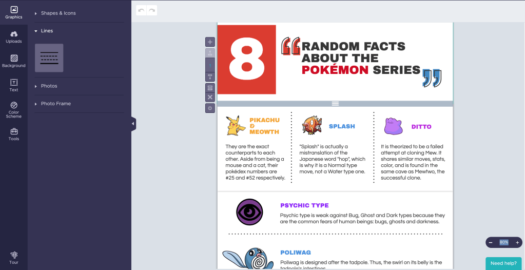
Choosing a template for this project was quite easy, as there was one that is basically a perfect fit for my content. The main colors it used were even red and blue, perfectly matching the main colors of Pokémon Sword and Shield’s logos, so I basically did not have to modify the infographic in any way. All I had to do was looking for some suitable images for each of my fact and apply them on the template.
Since the topic was about Pokémon facts, I wanted the overall design to have a colorful and somewhat cartoonist feels to match with the aesthetics of the franchise. This meant that the images I chose should also look cartoonist and colorful, and it proved to be pretty difficult to find some. For example, the fact about number of Pokémons were pretty hard to find a suitable supporting image, so in the end I used the number objects given by Piktochart to form the number 809 with red filling and black outline, matching the overall design aesthetics decent enough in my opinion. On the other hand, I could not find any suitable Pokémon Sword and Shield logo with similar feel for the final fact, and the one I finally chose still looked a bit out of place since it had no outline. Looking back, I could have use an editing software to edit the logo for the infographic to match the aesthetics, but the thought did not come up my mind at the time.
The end result
In the end, I think the final design looked pretty decent for an infographic. However, a criticism I can have for myself would be that it does look a bit “boring”, as the content strictly share same space sizes and nothing really stands out as being more important (although maybe since it is “random facts”, levels of importance might not be applicable to an extent?). I did intentionally tried to break the grids a bit with the Poliwag picture going outside of its frame, but that just made it look like a flaw in the infographic.

