
It is only natural to go from designing one page of content (infographics) to multiple pages of contents (e-magazine).
Compare to an infographic, a magazine is a more common medium that is used by the video game industry, so I did have some examples to follow for the content and design. Also unlike an infographic, an e-magazine would require much more contents, so I decided to gather contents from multiple games this time. The games I chose include Hollow Knight: Silksong, Celeste, Untitled Goose Game, Ori and the Will of the Wisps Pokémon Sword and Shield and League of Legends.
Getting content for articles
Magazines are published periodically, so their articles should be up-to-date with the latest news, at least to an extent. This did limit my options for contents drastically, making it harder to gather enough articles for the 16-page e-magazine, especially since I am not that up-to-date with the news in the industry myself aside from the games that I actually play and follow.
In the end, I managed to get enough articles for the magazine that were relatively recent at the time: The release of Chapter 9 DLC in Celeste, the partnership between League of Legends and Louis Vuitton and the news about Sirfetch’d in Pokémon Sword and Shield. The news about ‘Hollow Knight: Silksong’ and ‘Ori and the Will of the Wisps’ were quite older in comparison, being shown in E3 in June (which was about 3 months before the time of the magazine creation), but since those games are really remarkable and promising, I want to include them into the magazine. Last but not least, ‘Untitled Goose Game’ got a really successful release and its popularity exploded, managing to get into my YouTube recommendations, and with how fun and creative the game is, it instantly became part of the contents for my magazine.
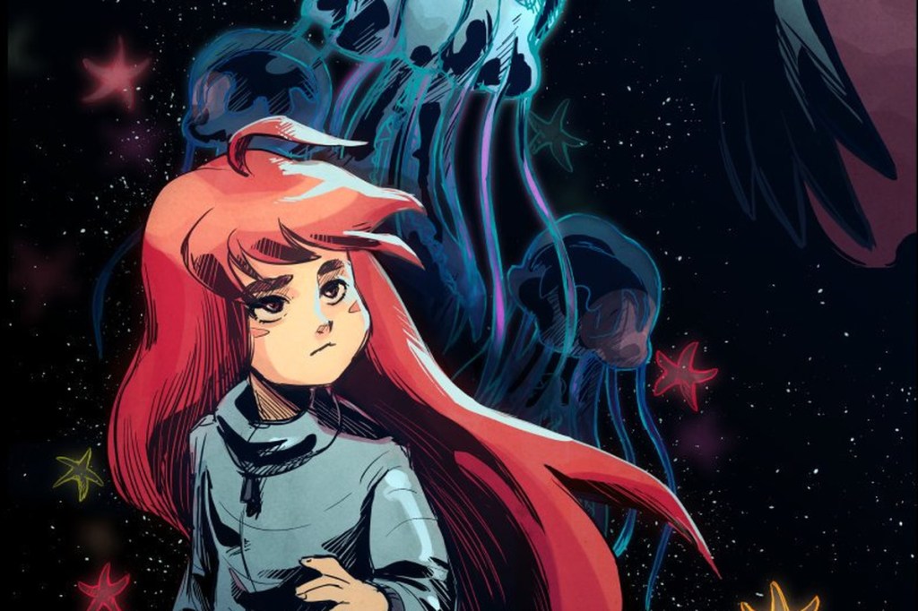
As for the title of the magazine, I, with my ultimate creativity, named the magazine “GameMag”. It is also a bit fitting considering that the name of the tool that I used for this assignment were ‘JooMag’.
Designing the magazine
Unlike with the infographic and Piktochart, I was not lucky enough to find a template that really suits my content, and I had to break the templates down and modify it significantly to fit my design. I even had to design the cover from scratch, since the cover template was basically unusable. On the other hand though, since I was being forced to break the template and do redesign, I had a chance to try out different compositions to make the magazine more dynamic and interesting compare to my infographic, even if some ends of looking less professional.
This project being an e-magazine instead of a traditional magazine also allowed for a few more options, in particular to my case, it was the inclusion of videos in the magazine. This allowed me to add videos to provide additional information or even design the entire article around the video itself. Another feature exclusive to digital magazine was emphasis effects on texts and photos, but I never actually utilized it, which is quite a shame since it could have been quite a good addition.
Unlike Piktochart, Joomag had a pretty terrible user interface, making working with the tool much more difficult than it should be. The tasks that should have been simple such as changing the color of texts were way too complicated, and sometimes it is almost impossible to figure out how to do a task that you want without watching the tutorial (while this task could have been done in 1 or 2 steps in most similar applications).
The end result
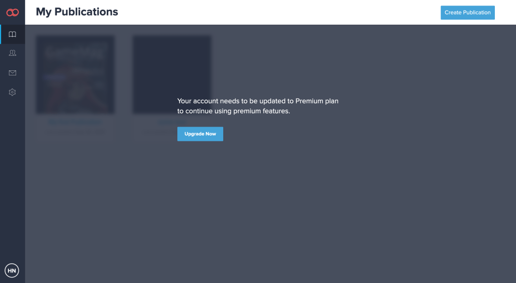
In the end, I am pretty satisfied with how the e-magazine turned out, even if it still has various design flaws. Unfortunately, my 15-day trial has expired, and I could not get access to my own magazine anymore (I could not even open it to capture some images for this article).
